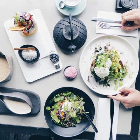
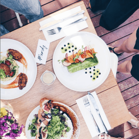
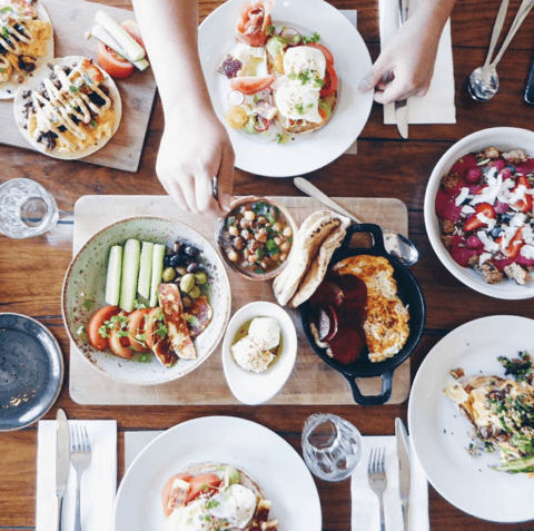
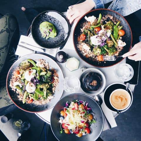
The first 10 in 10 segment for 2016 is from our beautiful and incredibly talented friend @changeroomfoods (also of @mumma.b.and.me). Ever seen those fabulous birds-eye-view food photographs of delicious cafe spreads from your favourite foodie Instagrammers? It’s highly likely one of those is the brains behind the business, Mandy. NO-ONE does a food flatlay like the lovely Mandy does, so we couldn’t think of anyone better to give us 10 tips for how to perfect this photography style. Better get practising!
+++++++++++++++++++
10 Tips for Epic Flatlay-Style Café Food Photography
Once, when I was a little girl, my mum was braiding my hair when suddenly, she froze. “Oh no,” she said. “You have a birthmark on the back on your neck. That means you’re going to love food.”
It was – and still is – true. I do love food. I love eating food. I love cooking and preparing food. And if you follow me on Instagram, you’ll probably agree when I say that I also love taking aerial- style photographs of my food when dining out.
I’m often asked for tips on how to take the perfect flat lay- style food photograph, so I thought I’d share them here. Let’s go!

1. Lighting
The first thing I do when I enter an eatery is look for a table that is flooded with natural light. Benches that run alongside a window are my personal favourite, but outdoor tables or tables located near windows are also great. You want the light to be bright enough so that you can easily see. It shouldn’t be glaringly bright, nor should it be dim.
2. The table
The colour and texture of your table’s surface makes a big difference – essentially, it’s your backdrop. White marble, pale wood and concrete- like surfaces tend to be most flattering; they’ll allow the colours in your meal to stand out without competing for attention.
3. The food
When I peruse the menu, in addition to asking myself what I actually feel like eating and what nutritional benefits each meal might be able to provide me with, I also try to imagine what the dish could look like. Unsurprisingly, pretty food tends to look prettier in pictures. A variety of fruits and vegetables, edible flowers and micro greenery all really up the “prettiness” factor.

4. Flowers and other props
Flowers are an easy and effortless way to add colour to your photograph. Most cafes have cottoned on to this, and will have flowers available on each table. When flowers are unavailable (or not very pretty, or not enough), be creative with your props! I’ve seen some Instagrammers remove their watches, bracelets and rings to add to their flat lay – I know it sounds weird, but it works. Glasses of water, purses or the corners of a magazine cover – they all work, too.
5. Realness
I personally find that the inclusion of cutlery in a photo adds a bit of “realness” (unless it’s something you plan to eat with your hands). Whether the cutlery stays on its napkin or is transferred to the dish depends on the dish – busy or really colourful dishes usually need to stand alone. But, be mindful of the cutlery. Unattractive cutlery will do your photo no favours!
6. Hand Modelling
I am a huuuge fan of hand modelling! Once again, I think it adds a bit of “realness” to photos. It also adds an element of liveliness, which is fun to see and interesting to observe. Well- manicured hands are a plus, as are hands donning pretty rings or wrists adorned with cool watches. Just make sure hands and wrists don’t cover too much food – otherwise it won’t really be a food photo, will it?

7. The Coffee
Coffee is an easy and effortless way to fill empty spaces in photos. Glossy- topped espressos and pretty latte art work best. I try to refrain from drinking my coffee until the photo has been taken, but half- empty cups can sometimes work well, too.
8. Avoid Reflection
This is something I’m often caught out on. Sometimes, cutlery is really shiny. Some teapot lids could double as mirrors. And the last thing you want to ruin your amazing photo is the reflection of you standing up, arms outstretched, to take a photo of your meal. I mean, we all know that’s what happened, but there’s no need to confirm it with your reflection in the lid of a teapot. Try to remove potentially reflective things from the table before you take your snap.

9. Table edges
I like including the edges of tables in my photos – I think it adds an extra layer of colour and depth. However, this depends on the table and on the floor. Concrete and some wooden floors work – old, dirty tiles; not so much. Try both and see what works better.
10. Photo editing
I edit my photos with an app called VSCO . HB1 is my filter of choice, and then I’ll add a bit of brightness and sharpness before finishing up the editing on Instagram. That said, different photos need different edits to really ‘pop’, so have a play and see what works best for you and your personal style.
+++++++++++++++++++
Following Mandy at @changeroomfoods.


